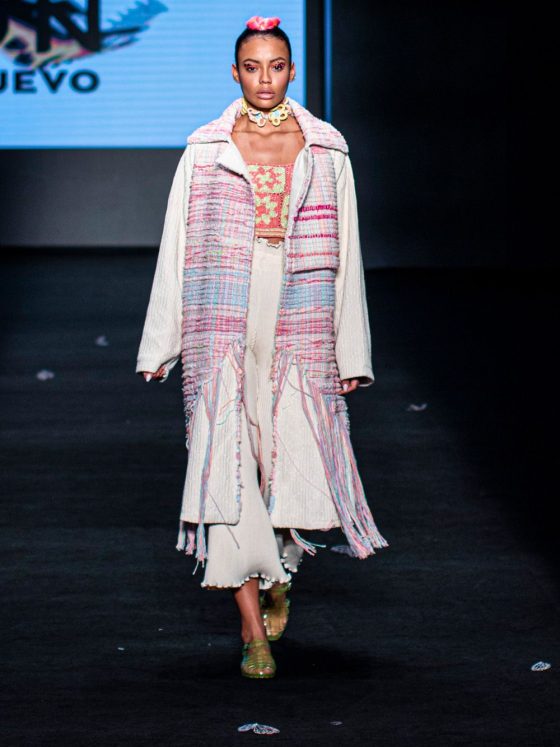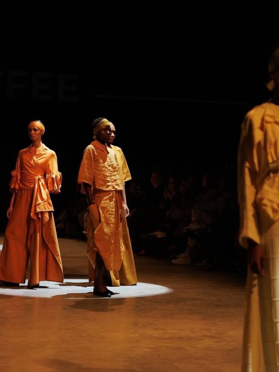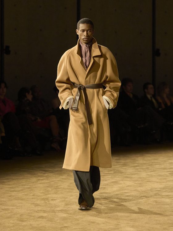

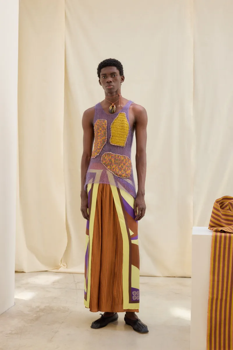
A retro tank top, purple pleated culottes and a silk scarf worn with a cape-like effect form one of the most revealing ensembles in WWD’s account of Lukhanyo Mdingi’s Spring/Summer 2023 collection. Its elements don’t fit into a single obvious category. The tank suggests sportswear, while the pleats and draped scarf introduce a different register. The outfit works precisely because its description poses a question rather than answering one: what makes these elements belong together?
“A collection holds together through relationships between garments, not through repetition of a single shape.” Omiren Styles Editorial Intelligence
Mdingi presented the collection, titled Burkina, during Paris Fashion Week in June 2022. Hypebeast’s coverage describes a wardrobe spanning knitwear, tailoring, dresses and sporting references, while foregrounding texture and multidimensional colour. SHOWstudio’s published record lists 32 lookbook images. Together, these sources establish the breadth of the offering, although this article does not assess every image independently.
Read together, the contemporary accounts suggest a proposition about coherence: a collection need not repeat one shape to establish a recognisable direction. But that proposition requires more than an inventory of colours and techniques. The critical task is to explain the relationships between garments and to distinguish an observed relationship from an attractive description of one.
That is the job of this piece. It is a retrospective, written some time after the show, so there is no rush to deliver a verdict. We can read what the critics noticed, see how their descriptions fit together, and be honest about where the evidence stops.
How contemporary coverage of Lukhanyo Mdingi’s Spring/Summer 2023 collection connects tailoring, sportswear, colour and textile experimentation.
Different Clothes, Connected Decisions
WWD’s tank-and-culotte description provides a concrete starting point because it identifies an outfit rather than merely naming a mood. It pairs the familiar sporting reference with pleating and expansive drape. On the evidence of that account, the potential connection is not matching formality or function. It is the deliberate combination of recognisable clothes whose meanings change when worn together.
A second ensemble in the same review pairs double-layered Bermuda shorts with circular side openings with a gauzy, hand-knit sweater. The description again places different kinds of visual information in conversation: an emphatically worked short and a more open textile surface. That offers a plausible continuation of the first outfit’s approach, even though the components differ.
The distinction is important. Calling both looks “experimental” identifies little beyond novelty. A more useful reading asks whether each combines a familiar garment with an unexpected treatment or companion. WWD’s selected examples support that possibility. They do not, by themselves, establish how consistently the relationship operates throughout the collection.
This is where reception analysis differs from a complete critique. A reviewer’s selection directs attention. Two memorable outfits can illuminate a collection, but they can also make its internal logic appear more resolved than a full sequence would reveal. Anyone who has read a review and then seen the whole show knows the feeling: the highlights were real, but they weren’t the whole story.
Colour as Connection, or Critical Shorthand
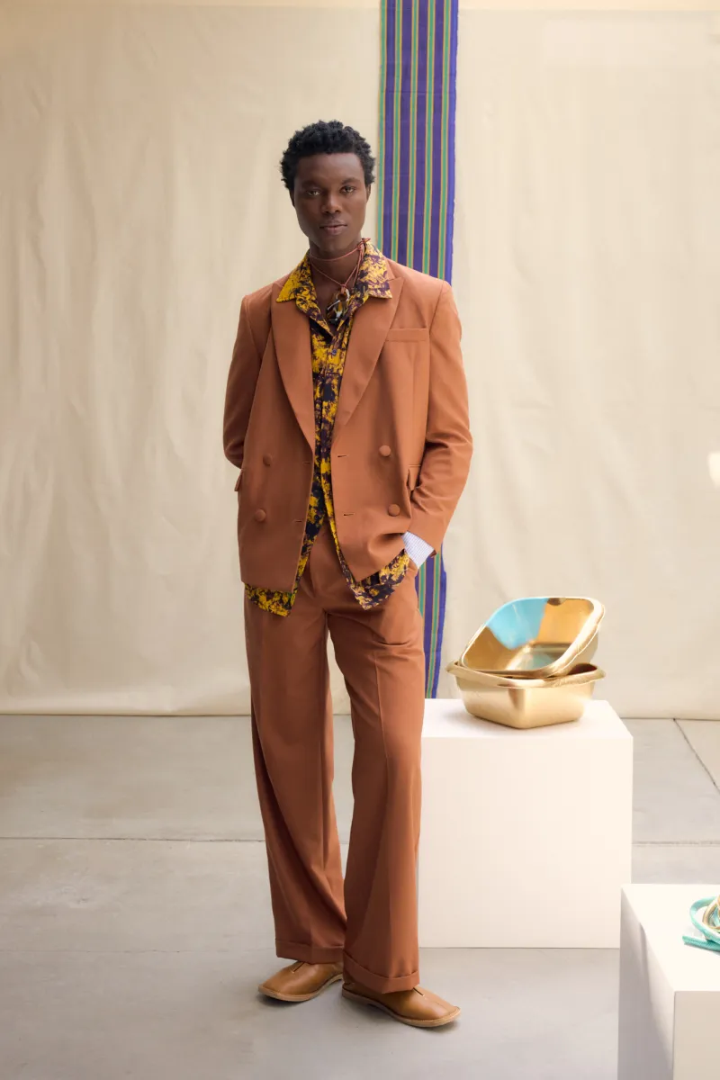
Hypebeast identifies coral, lavender, goldenrod and azure within the collection’s knitwear, alongside solid-colour and tie-dye tailoring. Its account also lists wrap pants, pleated skirts, shirts, dresses and jackets. Colour therefore becomes a connecting thread across garment categories, rather than a feature reserved for decorative pieces.
WWD offers a more specific example: a purplish-blue men’s suit with irregular rust-and-yellow tie-dye motifs. That description identifies the meeting of an established clothing form and a less regular surface treatment. It gives a critic something more specific to examine than a general claim that the collection is colourful.
Yet colour can become shorthand. A shared palette may help an audience recognise a collection without making its proportions or styling equally convincing. The more demanding question is what colour does within each garment: whether it defines a shape, interrupts it, organises attention or competes with other details.
The contemporary accounts establish that colour was prominent and distributed across categories. The further claim that it unified the entire collection would require a systematic comparison of the looks. Keeping these statements separate keeps descriptive observation from becoming an untested verdict.
Texture Needs an Account of Form
The coverage places considerable emphasis on surfaces. Hypebeast describes crochet tops with multicoloured appliqués, fringed elements and tonal quarter-zip pieces. WWD connects the collection with Mdingi’s developing relationship with the CABES social enterprise in Burkina Faso, facilitated through the Ethical Fashion Initiative. These details provide both a material vocabulary and context for its development.
The distinction between those two functions matters. A production relationship can explain where some work originated, but it does not automatically demonstrate a garment’s visual success. Similarly, an appealing textile cannot establish the labour conditions or economic impact behind its production. Neither publication’s collection account should be stretched into an independent assessment of those outcomes. Questions about who made a cloth and how they are credited are a separate line of inquiry, one we take up in our piece on protecting the cloth makers behind the fabric.
For criticism, the next question is how surface relates to form. Appliqué, fringe, open knitting, and tie-dye can all attract attention, but their presence alone doesn’t tell the reader whether a look is balanced. A close review should show where a silhouette gives an active textile room, where several elements compete, and whether quieter pieces create meaningful contrast.
The published reception supplies promising examples for that examination. It does not remove the need to perform it.
The Limits of a Persuasive Account
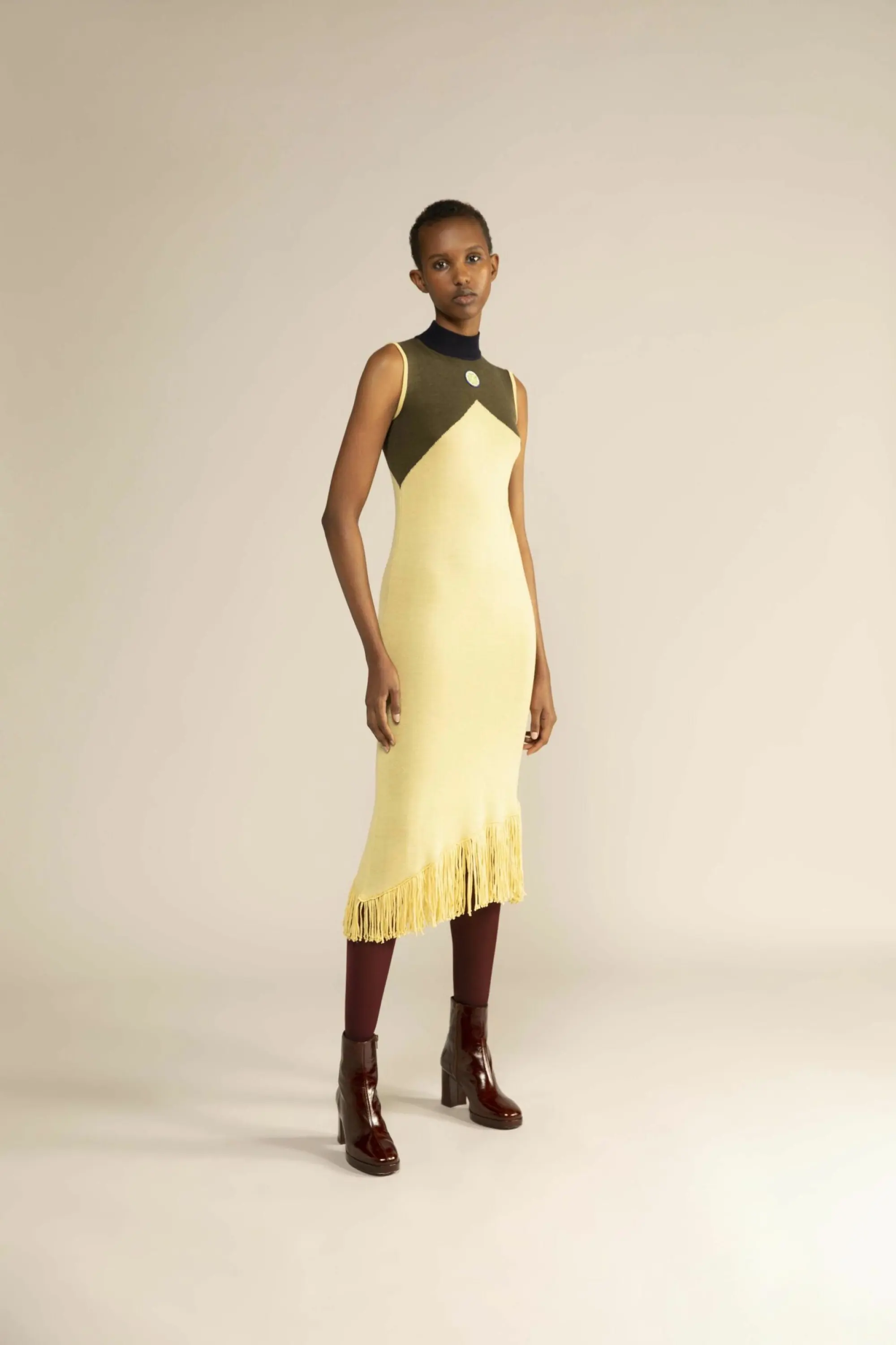
Accessories add another layer. WWD’s cape-like scarf contributes to the description of the tank-and-culotte outfit, while Hypebeast identifies a jewellery collaboration with South African label PICHULIK involving rope and brass. Such details can help articulate a presentation’s vocabulary, but they also raise the question of how much unity comes from styling rather than the garments alone.
That is not an argument against styling. Fashion presentations are constructed through combinations. It is a reason to be precise about the object of the judgement: an outfit may be persuasive as presented even when an individual garment makes a less distinctive proposition.
The two accounts offer useful evidence of what their writers noticed. They cannot establish that every look worked equally well, how the garments felt in wear or whether the collection’s apparent ease translated into physical comfort. Those are different claims requiring different access. A claim about fabric content or construction is similar: it needs checking at the source, as we explain in our guide to verifying a fashion brand’s fabric claims.
What This Reading Establishes
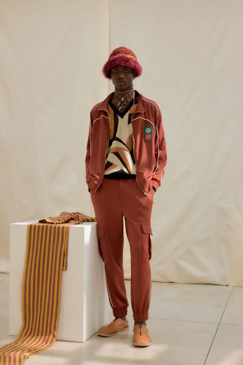
The reception of Burkina identifies several possible connections across its broad wardrobe: familiar clothing forms given unexpected companions, colour travelling between knitwear and tailoring, and textile activity set against recognisable structures. WWD’s specific ensemble descriptions provide stronger foundations for those observations than a general celebration of richness or craftsmanship.
The bounded conclusion is not that the collection’s coherence has been proved. Instead, it offers a credible hypothesis about how that coherence might work.
A completed visual critique would test that hypothesis against the full sequence, including looks that complicate it. Until then, the useful lesson concerns criticism itself: an account becomes more convincing when it explains relationships between identifiable clothes, rather than asking a mood, palette or cultural narrative to do all the work.
The Omiren Argument
Our view is simple. A reader should be able to follow coherence from one garment to the next, not something a writer announces—the strongest passages cover Burkina and name an outfit and show what sits beside what. The weakest fall back on mood, richness, or cultural narrative.
That standard applies to us as much as to anyone else. When we write about a collection, we aim to separate what we have seen from what we have been told, and to say plainly which is which.
Also Read:
- The Maker-Credit Test: What a Heritage Fashion Product Page Should Clarify
- After Africa Fashion Week London 2026: What Converted Into Orders, Stockists, Press or Partnerships?
- What Happens After a Fashion Showcase? The Measures That Prove Market Access
- The Beauty Retail File: What Is Required by Law, and What Is Required by a Buyer?
FAQs
When was Burkina presented?
Lukhanyo Mdingi’s Burkina was presented for Spring/Summer 2023 during Paris Fashion Week in June 2022. This article is retrospective, not a coverage of his latest collection.
Which published accounts inform this analysis?
The principal sources are WWD’s collection review and Hypebeast’s contemporary report. SHOWstudio supplies a published lookbook listing. The article analyses those accounts rather than claiming a complete independent visual assessment