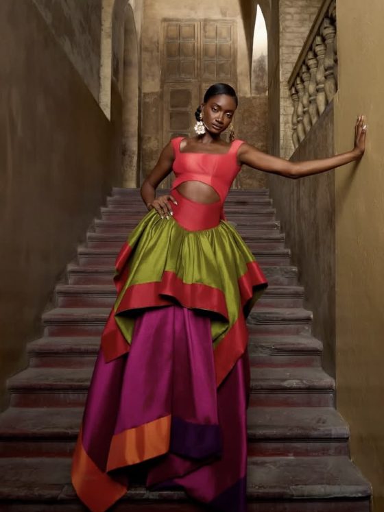
There is a moment happening in global style that is easy to miss if you are only paying attention to what is loud. The bold colours, the exaggerated silhouettes, the constant push for visibility, they dominate at first glance. But beneath that surface, a quieter shift is taking place.
Powder blue is at the centre of it.
It does not demand attention, yet it changes how attention moves. It softens spaces without disappearing into them. It carries a sense of ease that feels deliberate, not accidental.
This is where the misunderstanding lies. Soft colours are often reduced to emotion, calm, gentleness, and safety. But in reality, choosing softness in a world built on noise is rarely passive. It is a decision—a positioning.
Powder blue is not simply a visual choice. It is a way of navigating presence—how to be seen, how to be felt, and how to hold power without performing it.
From Lagos to London, powder blue signals control, not calm, redefining luxury identity and power in a world that rewards noise
Softness as Strategy, Not Aesthetic
Colour has always carried meaning beyond appearance. Red signals urgency. Black often holds authority. But powder blue operates differently. It slows things down.
Psychologically, softer blues reduce tension and create a sense of ease. But in social spaces, that effect becomes power. When everyone else is competing for attention, the person who creates calm becomes the anchor.
Across African societies, this idea is not new. Authority has often been expressed through restraint. A composed presence, measured speech, and controlled movement – these have long signalled leadership more than volume ever could.
Powder blue fits into that language. It does not interrupt. It steadies.
The question is not what it looks like. The question is what it does to the room.
Rewriting Luxury Without Noise
Luxury has long been defined by excess, visible branding, layered embellishment, and the need to prove worth through display. But that definition is shifting.
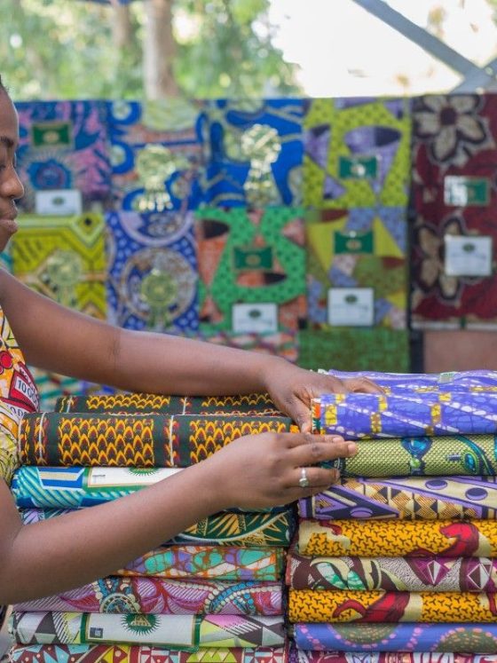
In cities like Lagos and Accra, a different approach is taking shape. Tailoring is cleaner. Fabrics breathe. Colours are intentional rather than overwhelming.
Powder blue sits at the centre of this shift.
It communicates ease, which in itself is a form of privilege. Not the kind that shouts, but the kind that assumes. The wearer does not need to prove anything. The garment does not fight for relevance.
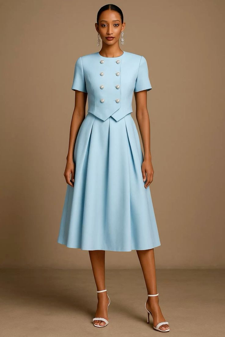
This is where African perspectives are quietly reshaping global ideas of luxury. In climates where movement, heat, and social interaction intersect daily, luxury is not about heaviness. It is about comfort without compromise.
Powder blue reflects light, carries air, and moves with the body. It aligns with lived reality, not runway fantasy.
So the colour becomes more than visual. It becomes a functional status.
Diaspora Expression: Precision, Not Symbolism
Across the diaspora, powder blue appears in different forms, but the intention remains consistent.
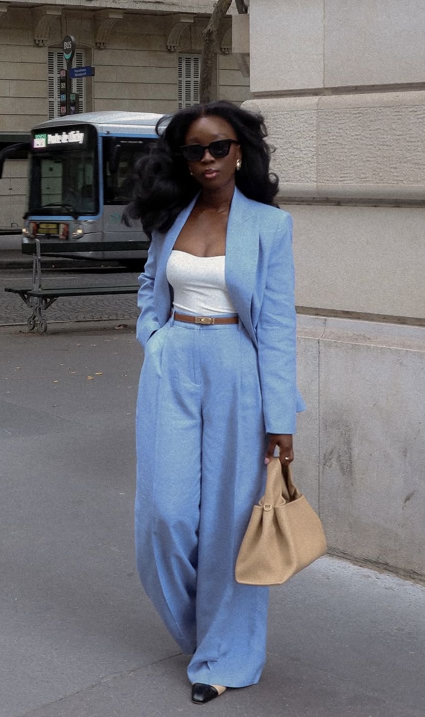
In London, it softens rigid tailoring, allowing African designers and wearers to reshape traditional silhouettes without discarding structure. In the United States, it appears in streetwear and creative industries, offering calm in environments often coded by tension or expectation.
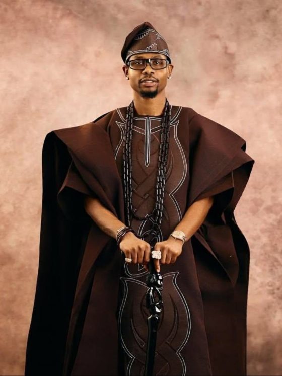
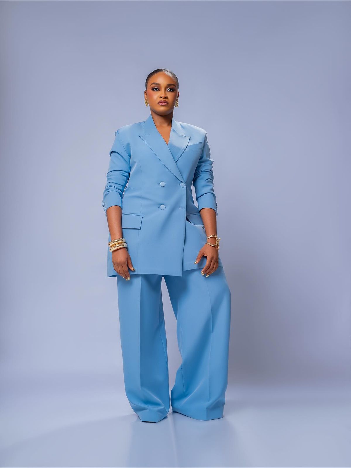
In Lagos, the meaning sharpens. Powder blue, worn in an agbada or kaftan, signals maturity and control. It suggests wealth that does not need decoration. It is often chosen by those who understand that presence does not require exaggeration.
This is not a coincidence. It is a shared cultural instinct.
Across locations, powder blue becomes a tool for navigating visibility—how to be seen without being consumed by the gaze.
Hair, Beauty, and the Politics of Being Soft
In beauty, softness has never been neutral, especially for African women.
There has always been tension around presentation, how much is too much and how little is not enough. Natural hair has been policed. Bold colours have been labelled excessive. Softness itself has been misunderstood as weakness.
Introducing powder blue into that space disrupts the rules.
On darker skin tones, it does not fade. It contrasts. Whether in eyeshadow, nails, or styling details, it creates a visual that is both calm and striking.
This duality matters.
It allows women to exist outside expectations, to be soft without disappearing, to be expressive without being defined by that expression.
So the colour becomes political. Not because it is loud, but because it refuses to conform to existing definitions.
Read Also:
Women, Ambition, and the Refusal to Perform Strength
There is a long-standing expectation that strength must be visible. Especially for African women, strength is often tied to endurance, resilience, and the ability to carry weight without pause.
Powder blue offers a different language.
It suggests that ambition does not always need to be aggressive. That presence can be controlled rather than asserted. That power can be quiet and still effective.
This shift is not about aesthetics alone. It reflects a broader rethinking of identity and of how women choose to present themselves in workplaces, social spaces, and their personal lives.
To wear powder blue in this context is not to retreat. It is to define strength on one’s own terms.
Sustainability as Practice, Not Language
Global conversations around sustainability often rely on terminology that feels distant from everyday life. But in many African contexts, sustainable fashion has always existed in practice.
Clothing is reworn across occasions. Fabrics are chosen for durability. Style is built around longevity rather than constant replacement.
Powder blue aligns naturally with this approach.
It does not tire quickly. It transitions across seasons and settings. It holds relevance without needing reinvention.
So its value is not in being labelled ‘sustainable’. It is in being lived.
Conclusion
Powder blue does not compete with louder colours. It does not need to.
Its strength lies in its restraint, its ability to shift energy without demanding attention. In a world that often rewards speed, noise, and excess, it offers an alternative—one rooted in control, clarity, and intention.
What makes it powerful is not how it looks, but what it represents.
A refusal to perform.
A confidence that does not explain itself.
A presence that holds, rather than chases, attention.
That is why powder blue matters.
FAQs
- Why is powder blue considered powerful?
Because it quietly influences perception, creating calm and control in spaces where others rely on visibility.
- How does powder blue redefine luxury?
It shifts focus from excess to ease, emphasising quality, comfort, and confidence over display.
- Is powder blue culturally relevant across regions?
Yes, it adapts across African cities and the diaspora while maintaining a shared meaning of restraint and presence.
- What role does it play in beauty and identity?
It challenges ideas of softness by allowing expression that is both calm and visually striking, especially on darker skin tones.
- Why does powder blue matter today?
It reflects a broader cultural shift toward intentional living, where power is expressed through control rather than noise.